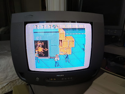
This proof of concept works inside Adobe Photoshop through an ACTION, a PAL file and a layered TIFF file. One works with the TIFF file on an specific layer in an area of 256x192 pixels located on the Double Dragon colored preview you see here (top left):
The top 2 screens starts empty, you draw on the left one using the 2 rows of pure colors right underneath it, the rows below are what they will become after processed. There is a total of 24 colors to be used.
Notice some are marked background black? Those produce specific dithers that might not combine with everything and must be used considering its tone and texture, a good example is the blue/red brick color, the third from the left, you don´t want bricks on the sky nor the clouds unless you are doing a cloud city ;)
The pallets on the low right have 18 colors, they skip the specific ones, and are arranged as an RGB sequence, 8 hues with 3 shades each for the left scheme and 4 hues with ~5 shades for the right one.
These ones are easy to work with and good grounds for converting existing stuff, like the Double Dragon II screen shot you see there. This 18 color pallete is very close in appearance to the dithered artifact colors, it is best used when you want to create something original. For conversions, you might want to work-shift those tones into a more general RGB space and do the back indexing.
These ones are easy to work with and good grounds for converting existing stuff, like the Double Dragon II screen shot you see there. This 18 color pallete is very close in appearance to the dithered artifact colors, it is best used when you want to create something original. For conversions, you might want to work-shift those tones into a more general RGB space and do the back indexing.
So, on the left screen, you then have your image/art using a palette that is contained on the lower pallete rows. Press F5 to activate the ACTION and it creates a layer containing the preview (as we actually see on the above screen shot) and a black and white equivalent to send to the COCO.
---
Art wise, it helps to better understand the native colors and dithers, so here are the 24 indexed pure colors you are going to do your art with, analysed with the superb DawnBringer's tool.
Discard the diagrams that deals with the pure colors dithers, they won´t work and the coco artifact colors already have their own dithers. Keeping that in mind, next is the previewed artifact colors:
As you can see, some of the diagrams are very inspiring into what can be done and how things are going to mix/blend in. Finally, you have the black and white equivalent just for fun:
An interesting aspect on the black and white version is its usage on the alternate green set (no artifacts) or on a Dragon computer. If it needs to be compatible with the COCO, then if it uses these dithers, you may know what it will look like on the other side.
The system is now complete as its intended goal, a proof of concept prototype running inside Photoshop that helps creating PMODE4 artifact colors. Only proper documentation is missing now ;)
Since this works just fine (at least for me :) ), it might be worth looking into making a better system or an add-on to an open source tool. What would you recommend?


No comments:
Post a Comment